Stakeholders
VP of Product
Senior Product Designer
Growth Product Manager
FE Software Engineers
BE Software Engineer
Duration
1st phase | Product Discovery
Feb 2024 - 2 weeks
2nd phase | Ideation & Wireframing
Feb 2024- 1.5 weeks
Overview
This project focused on improving how buyers navigate the Qogita catalogue, based on feedback that it was hard to use.
Buyers interact with Qogita in different ways—some focus on supply, others on demand, and some upload carts directly to find products on our catalogue, which made finding specific products difficult and often led to confusing search results.
I led research to figure out how to make the catalogue easier to use, including recruiting participants, interviewing users, and analysing the feedback to guide design changes.
I collaborated with engineers to brainstorm and develop the best solution that met user needs and aligned with business goals. I presented key findings and next steps to senior leaders, ensuring focus on the problem statement and overall project direction.
HIGHLIGHTS
New search box | Brand Search

New search box | GTIN search
CONTEXT
Simplifying product discovery for buyers.
Buyer feedback has shown that our catalogue can feel overwhelming and hard to navigate.
Buyers use Qogita in different ways—some focus on supply, others on demand, and some bypass the catalogue entirely by uploading a cart.
This variety in usage leads to inaccurate results when searching for specific GTINs, making it harder to find the right products.
Focused on streamlining buyers' searches for deals.
Our goal is to simplify the process of finding great deals on Qogita.
To achieve this, we need to explore how to improve the way users find products on Qogita.
RESEARCH APPROACH
Let's first understand what would make the search experience more digestible.
Understanding user search priorities
Supply vs demand driven search
Are users more inclined to search based on available supply, or do they focus on demand trends?
Single GTIN vs bulk GTIN
Do our users prefer working with a single GTIN or handling bulk GTINs?
Sourcing method
What sourcing methods do our users prefer: manual, API, or tender-based?
Figure out how tech savvy our users are
How comfortable are our users with using technology or online platforms?
RESEARCH FINDINGS
Qogita users follow two distinct journeys.
Targeted product search
The user aims to locate a specific GTIN to evaluate price competitiveness and verify product attributes.
Exploratory product search
The user seeks to browse within a specific brand or category to explore and refine their options.
User journey insights.
TARGETED PRODUCT SEARCH

Main pain points:
Inaccurate product information between the GTIN searched and the actual product.
Struggling to find accurate results when searching by brand, categories and specific product attributes in the search bar.
Difficulties in cross-checking product info on Qogita due to unclear and incomplete data.
Insufficient information or images for effective cross-verification, leading to uncertainties.
DESIGN FOCUS
Ensure buyers quickly and accurately find products by GTINs, categories, or brands, with the ability to cross-check product images for confirmation.
THE PROBLEM
Revamping Qogita's search.
The search bar is typically the first stop for buyers on Qogita, often used to look up GTINs, brands, or categories. However, this approach presents a few challenges:
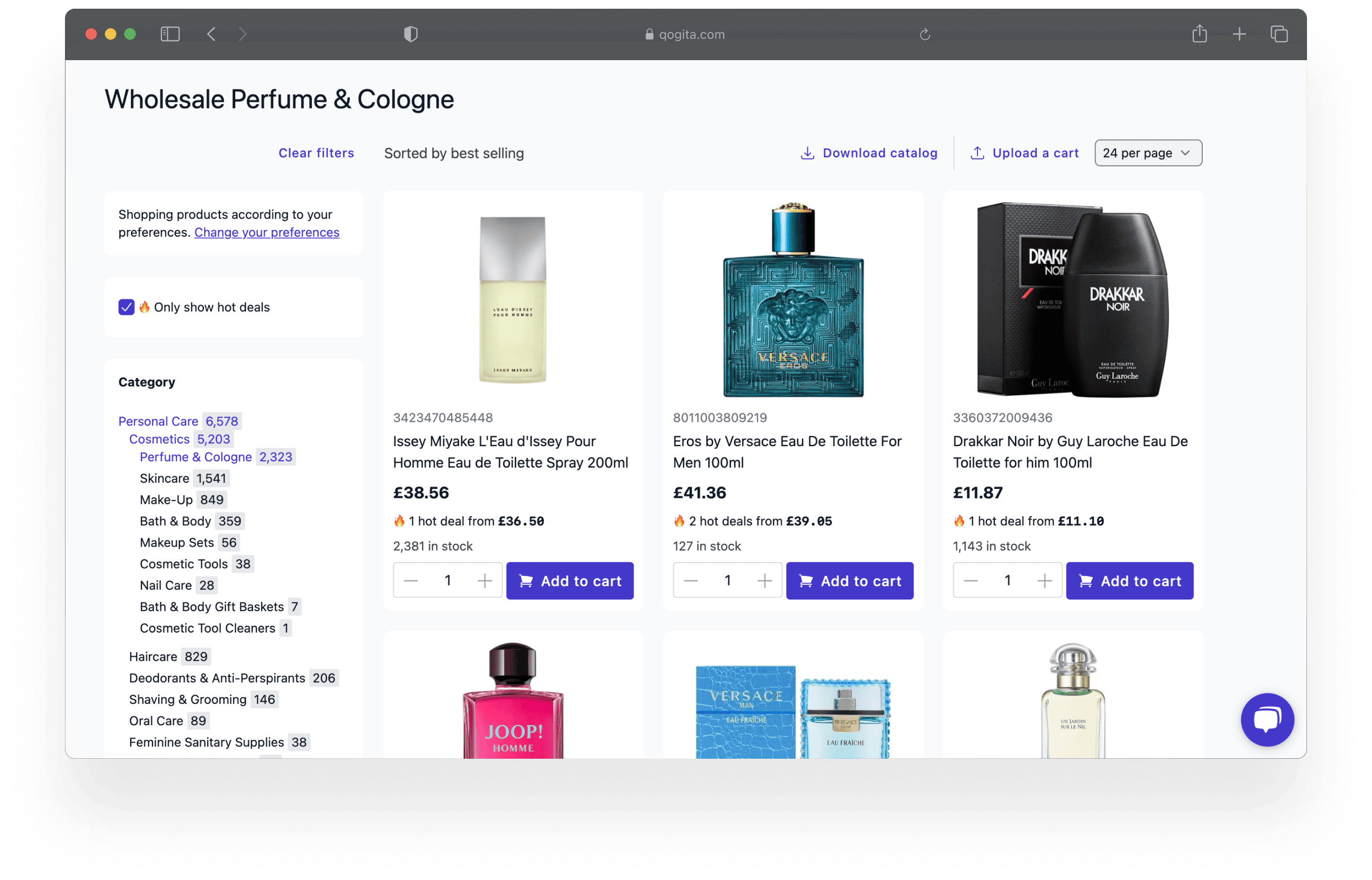
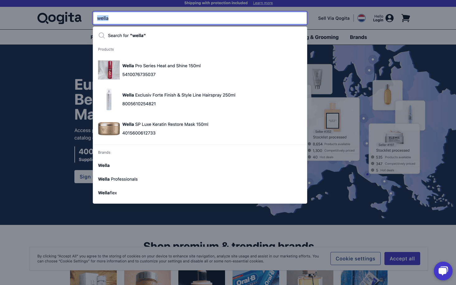
Firstly, when a buyer searches for a term like "Wella," the platform displays all products that have "Wella" mentioned anywhere in the product data.
This means buyers may see multiple results for a specific GTIN or even results for unavailable products. These issues complicate the procurement process for our users, making it harder for buyers to find the exact products they need quickly.
Search ranked by popularity.
I was searching for "Victoria's Secret Vanilla Scent" but struggled to find that specific scent. When using these keywords, I expected to see relevant results at the top, but I found the vanilla scent buried in the catalogue.
Old search box

search ranking
SOLUTION
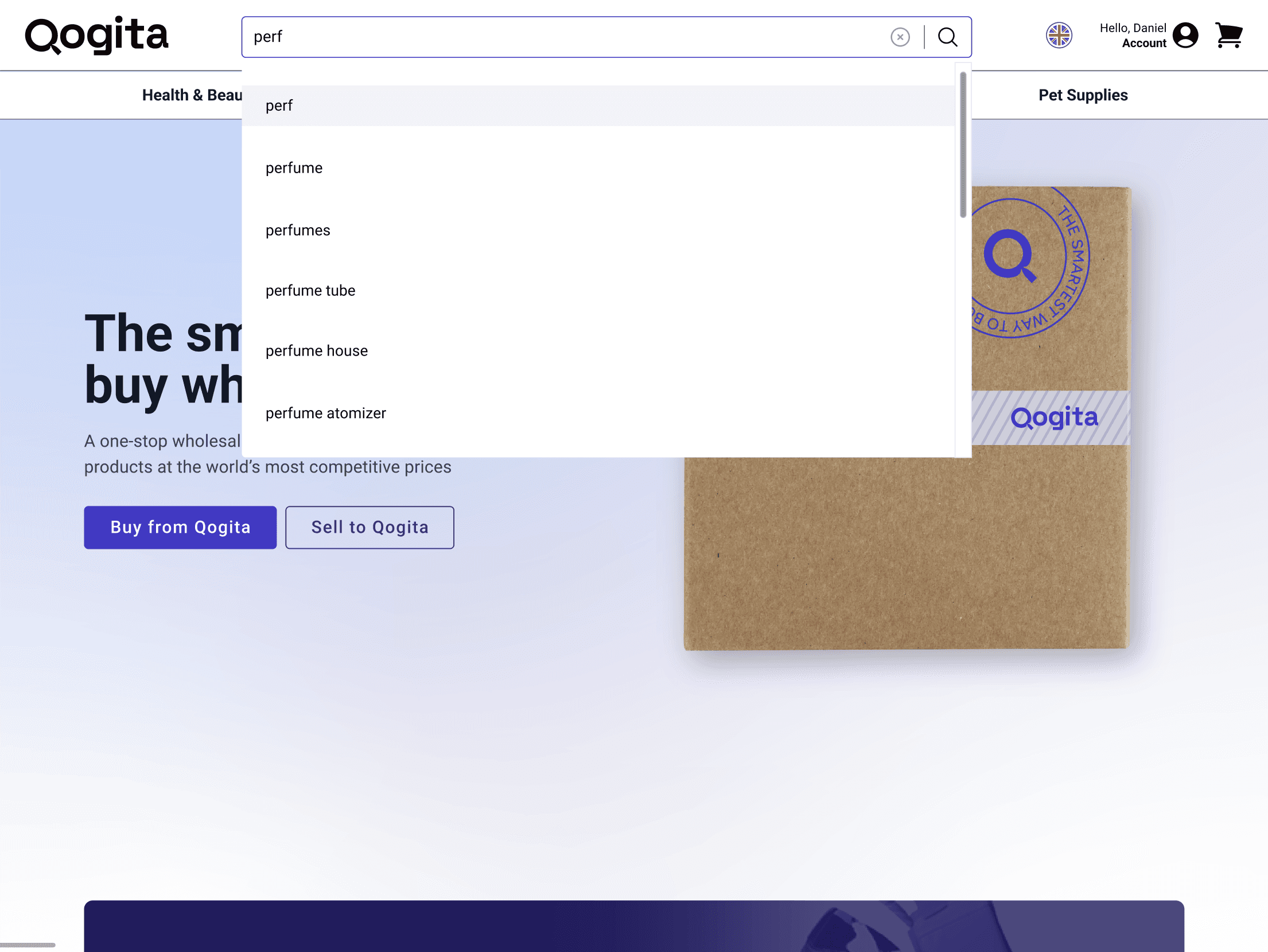
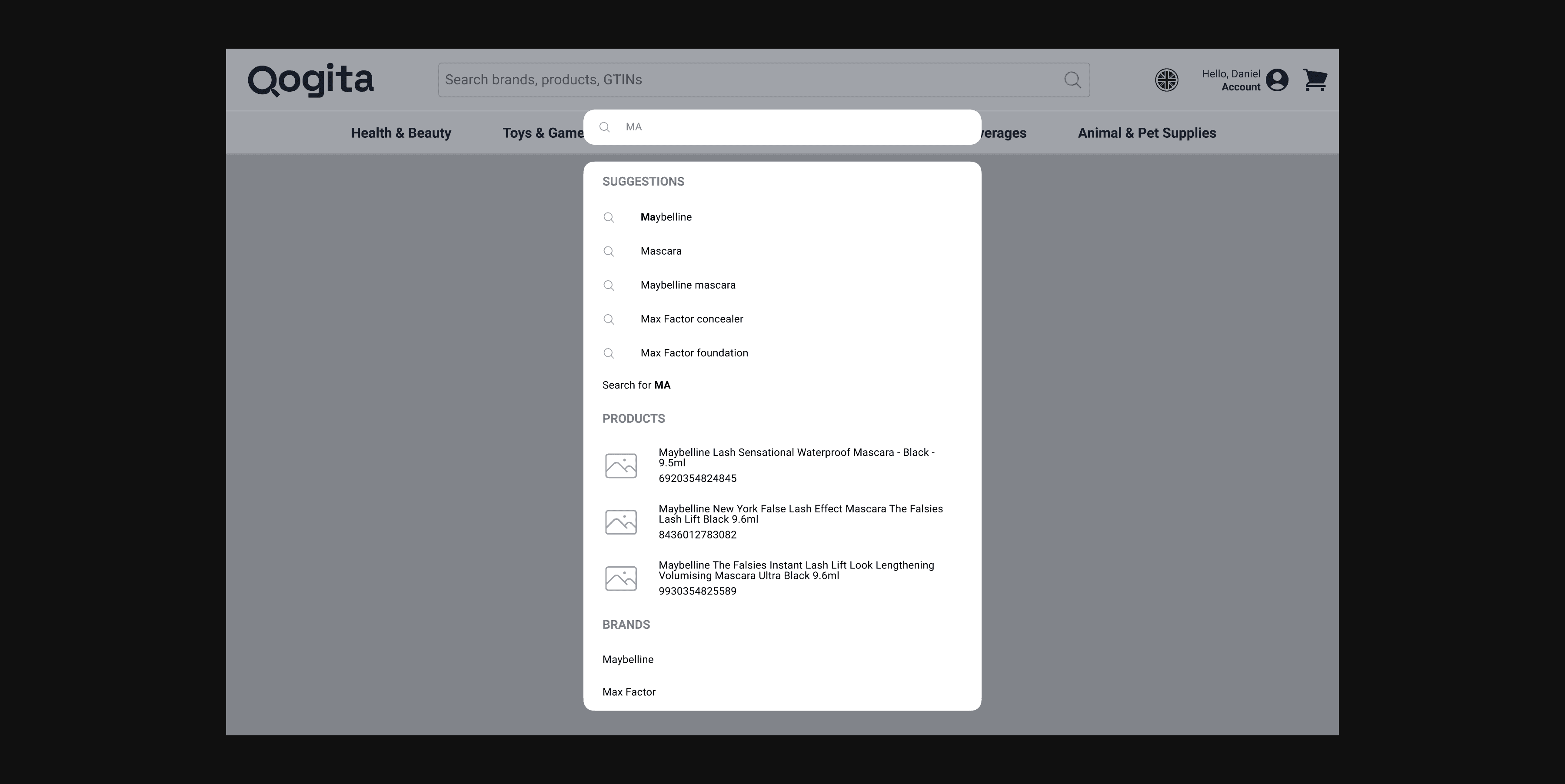
Rich, categorised search suggestions.
To tackle the problem, we believed the first step in elevating the search experience is delivering rich, categorised suggestions. This helps users quickly find what they need or enter the results page with a sharper, more focused search context.
Implementation: what we support and how we do it.
GTIN search with single result
Exact GTIN (Global Trade Item Number) search will be triggered only when 13 digits are specified. Anything different than 13 digits will trigger a regular search.
Brand search
Top 3 brands in which the name matches the query entered by the user.
Category search
Top 3 categories in which the name matches the query entered by the user.
Product title
Top 3 products in which the GTIN or name matches the query entered by the user.
MAPPING THE SEARCH FLOW
Design , tech and user flows.
I collaborated early in the design process to align with engineers on tech requirements and design considerations. We brainstormed a user flow to cover all scenarios, ensuring every state was accounted for and decisions were clear. The main question from engineers was: "What do users see when…?" Below is our initial user flow, though some parts changed as we refined the solution and wireframes.

search flow ideation
IDEATION
Focusing on what's most important to users.
With a rough user flow in place and a plan for what to show in different states, I started ideating, focusing on what matters most to users. They want to cross-check images to confirm they're finding the right product, explore brands, and view specific products within specific categories.

Empty state | Logged out users
Empty state | Logged in users

desktop search box v1 | In progress state
Empty state | Logged out users

Modal design.
Lastly, I explored a search modal design as part of the ideation process to create a more focused experience. When users click on the search bar, the modal activates, minimising distractions by isolating the search area and displaying product images more prominently. I wanted to enhance clarity and usability, allowing users to concentrate on relevant search results.
By expanding the space for search suggestions, products, brands, and categories, I aimed to help users find what they need quickly.
Search modal
LAYOUT
Getting the basics down- responsive layout grids.
We implemented a standardized set of layout grids and breakpoints, which is essential for ensuring quick and consistent design execution. At Qogita, we primarily design at a 1280px breakpoint to streamline our workflow and accelerate the design process. We established that mobile designs would activate at a 639px breakpoint, while desktop designs would resume at 640px.

Search box | Desktop | 12 column fixed / 24px margin / 16px gutter

Search box | Desktop | 5 column fixed / 8px margin / 16px gutter

Full-screen search | 320-639px | 4 column fixed / 16px margin / 8px gutter
Full-screen search | MOBILE | 4 column fixed / 16px margin / 8px gutter
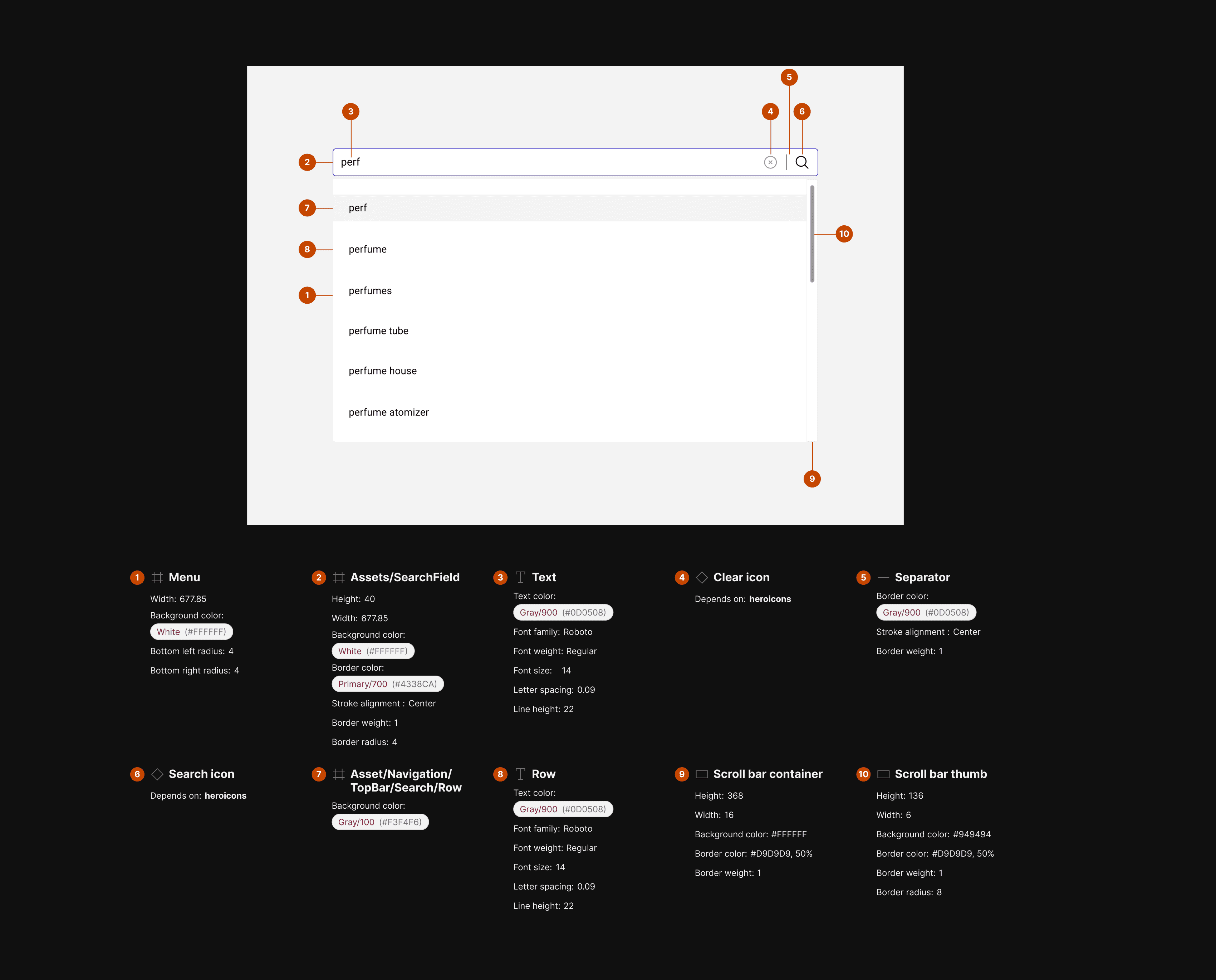
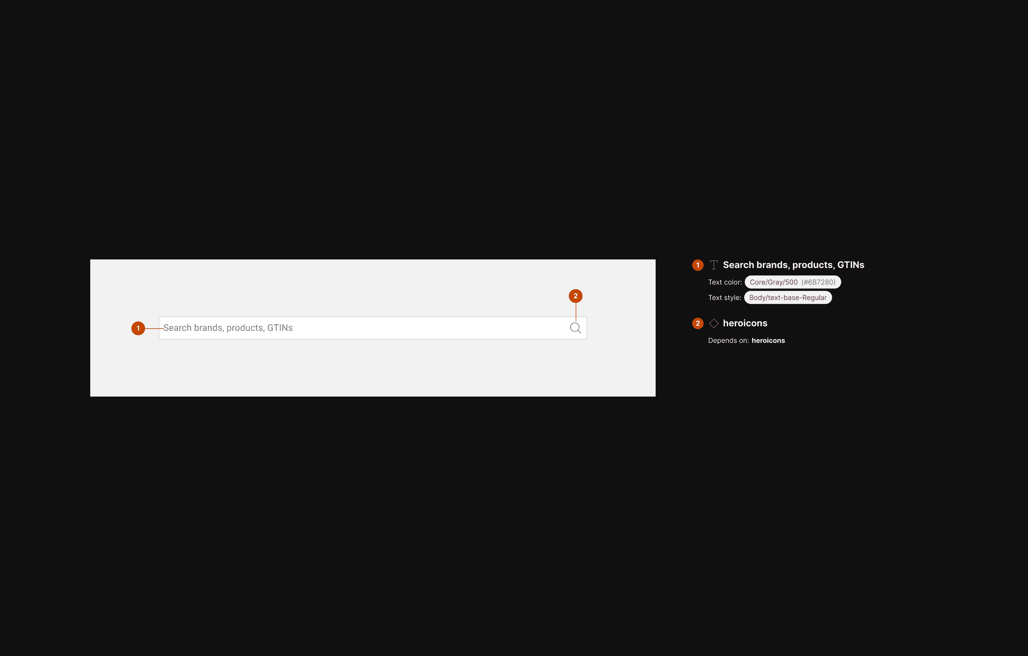
VISUAL DESIGN
Old vs new combobox .
We aimed to align our combobox with our design system, largely maintaining the same styles for focus, hover, and active states. However, we identified issues with the existing combobox, particularly a persistent bug in the focus state that had not been addressed. This presented the opportunity to fully redesign and deprecate the previous component. Another consideration during this process was the modal design, which also influenced our approach.
Old combobox | Desktop & mobile

NEW combobox | Desktop
New combobox | SEARCH BAR | anatomy

New combobox | SEARCH BAR | LAYOUT & SPACING
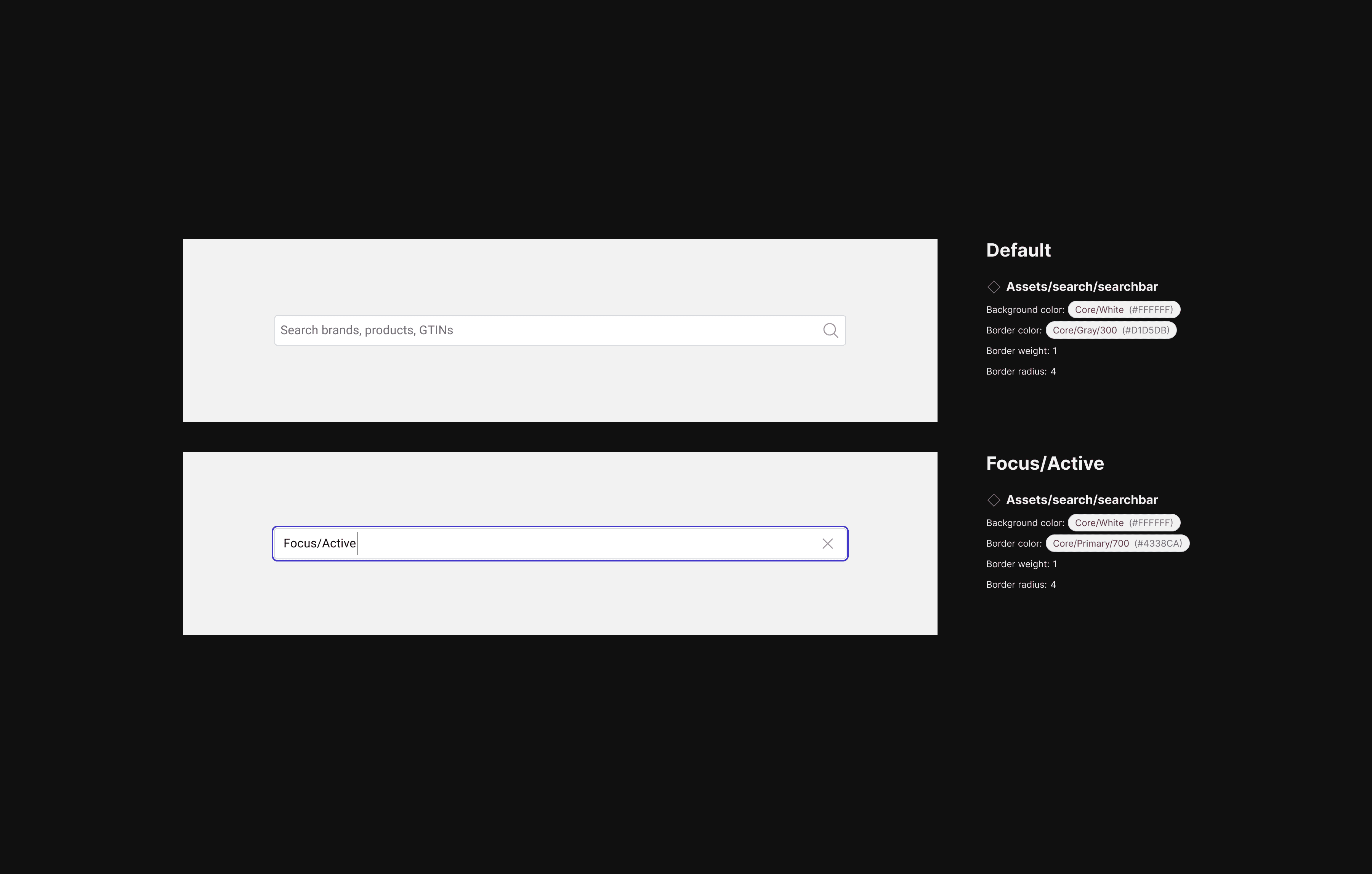
New combobox | SEARCH BAR | states
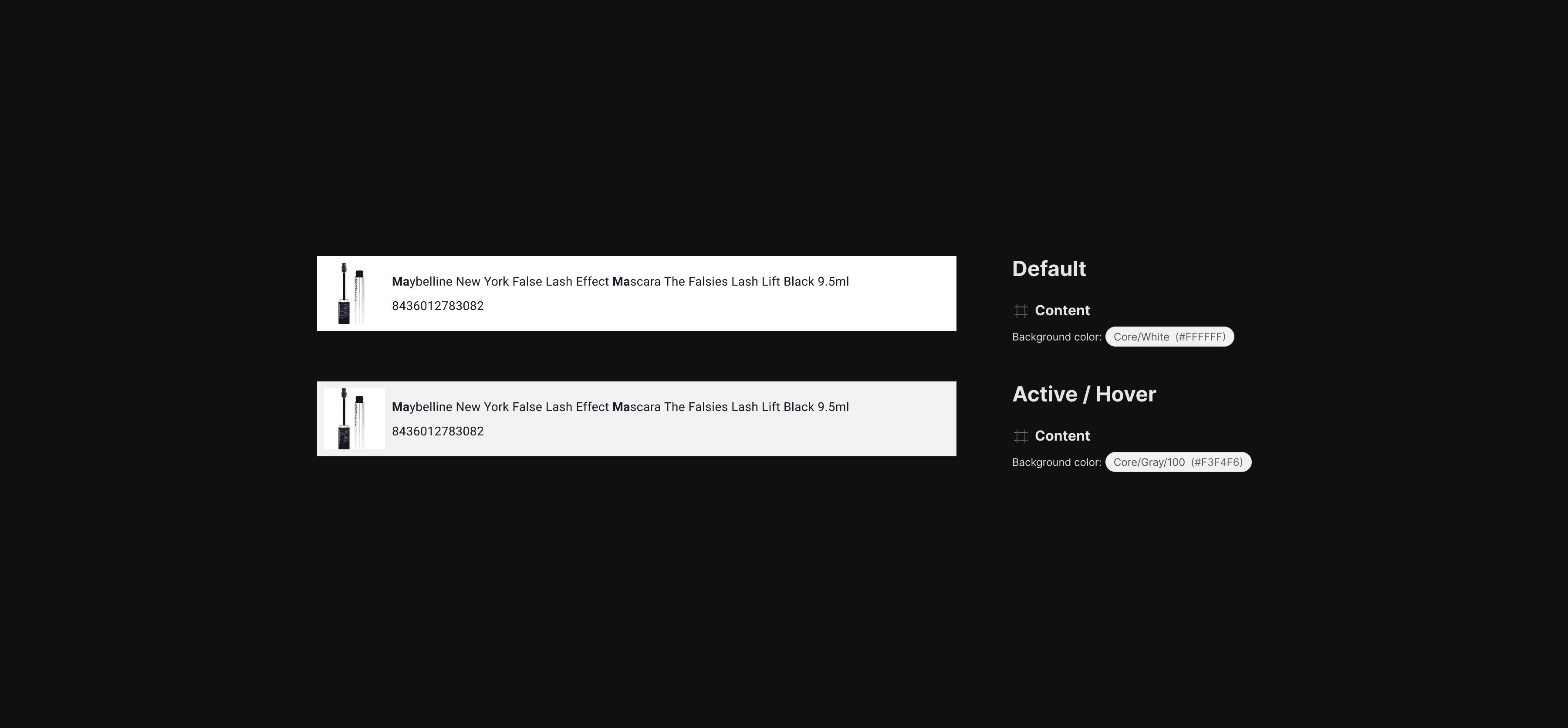
New combobox | PRODUCT CARD | states
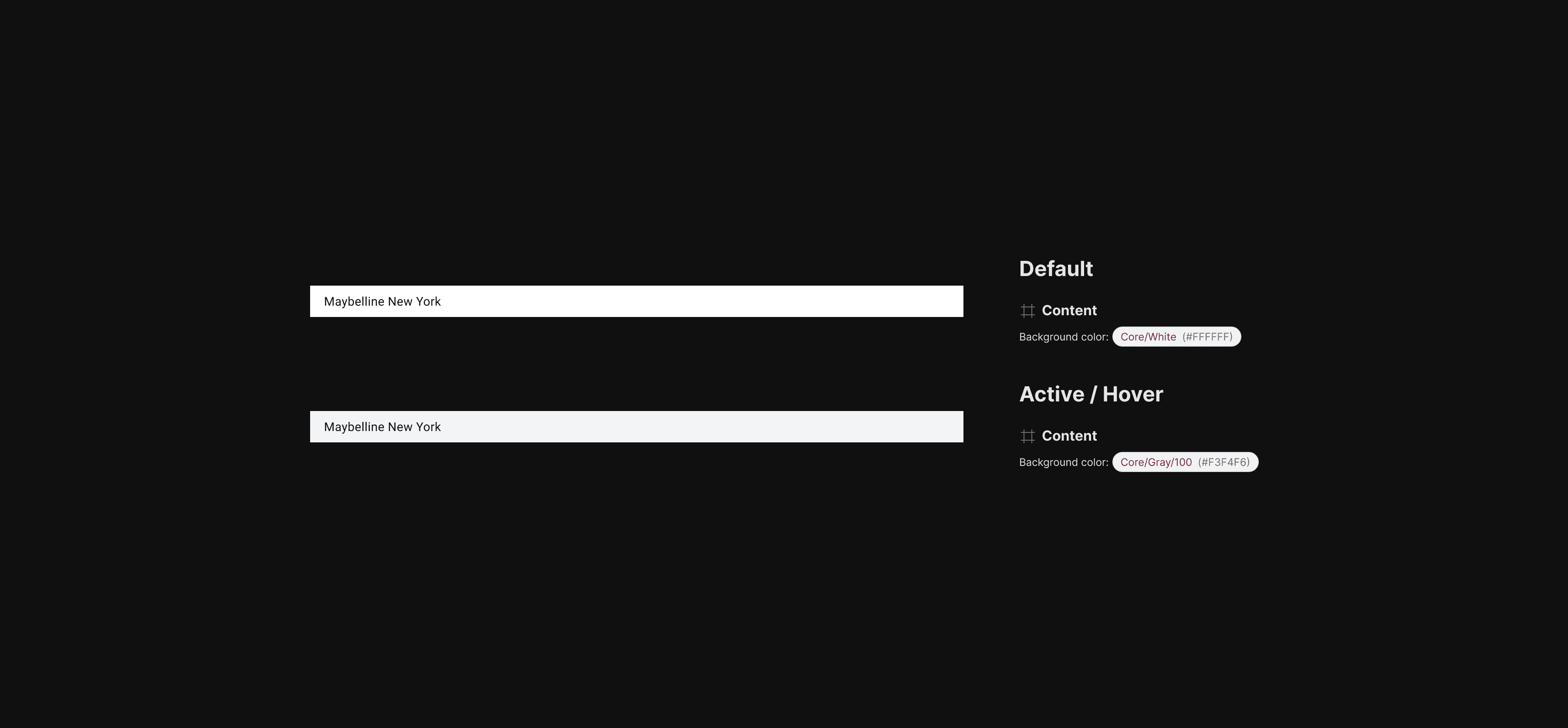
New combobox | Text Item | states

New combobox | Layout & spacing | Desktop

New combobox | padding | Desktop

New combobox | spacing | Desktop
FINAL DESIGNS
Categorised search box results.
Search suggestions are now neatly sorted by products, brands, and categories, making it easier for users to find what they need. Users can click on a product to go straight to its PDP (product detail page), or choose a brand or category to quickly filter the catalog.
FULL SEARCH FLOW | DESKTOP | VIDEO LOOP

EMPTY STATE | DESKTOP

EMPTY STATE | MOBILE

In progress STATE | Desktop

In progress STATE | mobile

cOMPLETED STATE | dESKTOP

cOMPLETED STATE | mobile
ESTIMATED IMPACT
Key metrics.
The primary metric we will track is the ratio of "Add to Cart" actions to the number of searches.
Risk of outliers
There's a potential risk of outliers, such as a single search leading to an unusually high number of "Add to Carts (e.g., 1 search resulting in 1,000 add to carts) which is something we're keeping in mind when evaluating the impact of this feature.
Supportive metrics.
Searches with brand filters applied
Portion of searches with empty results
Breakdown of searches by search type (product, category, brand, query)
RETROSPECTIVE
Project retrospective.
Share designs early and often
I made sure to share my designs early to gather initial feedback and keep everyone aligned. Doing this regularly helped me make adjustments quickly and kept the project on track.
Align designs with the time limits set by engineers
I could have done a better job aligning my designs with the time constraints set by the team, especially the engineers. Being more mindful of the appetite set for the project would have helped streamline the process and avoid any last-minute adjustments.
Ensure tech and design alignment early
It was very important to ensure tech and design alignment throughout the project. Keeping both sides more closely synced would have prevented any miscommunication and helped us work more efficiently.
Track key decisions in notion
One important takeaway we recognised was the need to track decisions in the project document. This will help us ensure clear alignment throughout future projects and keep everyone informed.